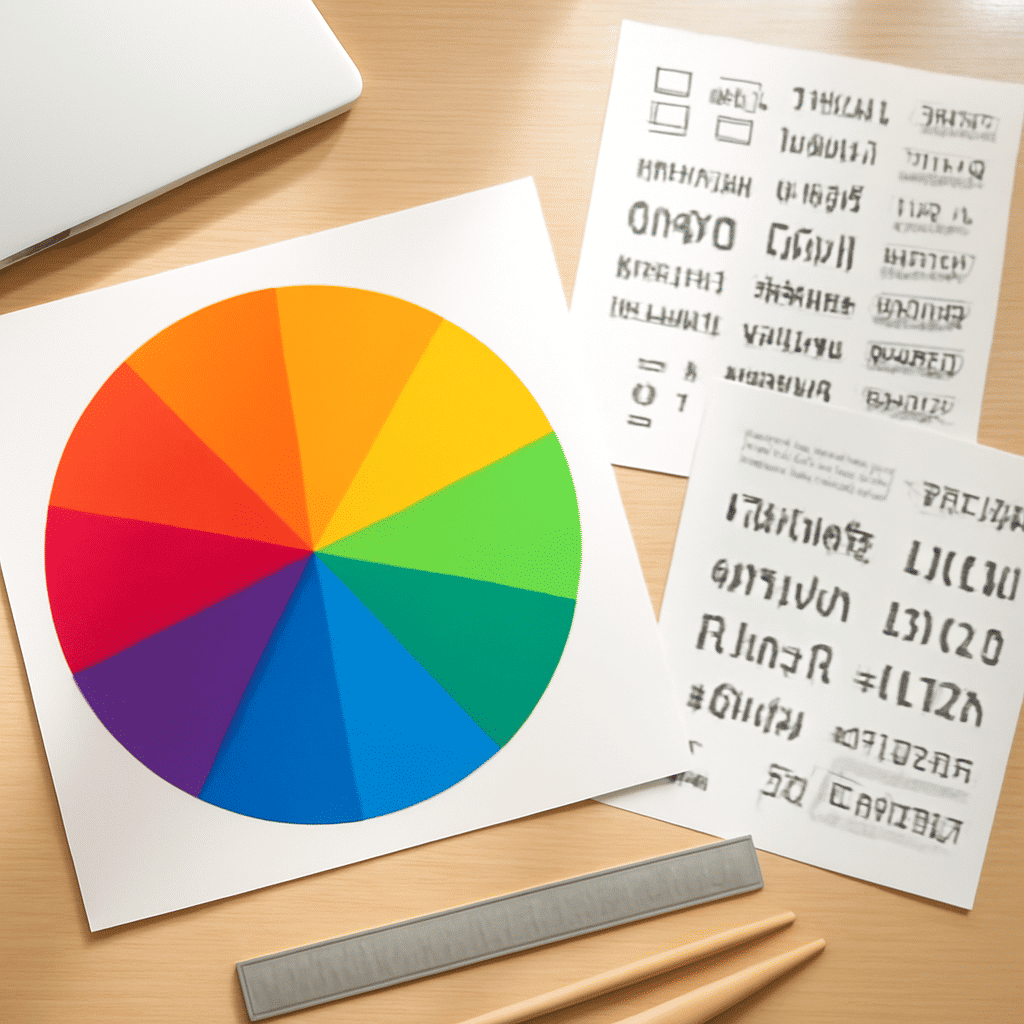
In the ever-evolving world of digital design, the delicate dance between color and typography plays a pivotal role in shaping how a website is perceived and interacted with. By delving into these elements, designers can craft experiences that are both visually appealing and functionally effective.
The Power of Color
Color is far more than just an aesthetic choice; it is a powerful tool that can evoke emotions, convey messages, and influence behavior. Each hue carries its own set of associations that can impact how a visitor perceives a site. For instance, blue often suggests trust and professionalism, while red can evoke excitement or urgency.
Understanding the color wheel and the relationships between colors—such as complementary, analogous, and triadic—can help create palettes that are harmonious and visually striking. The use of contrasting colors can direct attention to key elements, ensuring that critical information stands out and engages users effectively.
Moreover, accessibility considerations should not be overlooked. Ensuring color contrast meets accessibility standards is crucial for readability, allowing all visitors, including those with visual impairments, to navigate the site with ease.
The Art of Typography
Typography, like color, is a vital component in establishing an online atmosphere. The choice of fonts, spacing, and layout greatly influences readability and the overall aesthetic. Serif fonts often convey tradition and sophistication, while sans-serif fonts tend to be perceived as modern and clean.
The key to effective typography lies in hierarchy. By differentiating text elements such as headings, subheadings, and body text through size, weight, or color, designers can guide visitors through the content seamlessly. This helps users process information in an intuitive flow, enhancing their overall experience.
Additionally, it's important to consider responsiveness. With the diverse range of devices accessing websites today, typography should be flexible, adapting to various screen sizes without losing its intended impact.
Synergy Between Color and Typography
When unified thoughtfully, color and typography can transform a website from merely functional to truly engaging. The trick lies in creating a cohesive design language that aligns with the message being communicated. For instance, pairing a bold color palette with strong, geometric fonts can convey energy and dynamism, while soft colors combined with elegant script fonts might suggest sophistication and elegance.
Interactive elements also benefit from this harmony, as users are more likely to engage with buttons, links, and forms if they are visually distinct and intuitively designed. This increases user interaction and satisfaction, resulting in a more memorable digital experience.
In conclusion, the intersection of color theory and typography in website design is an art and science that combines beauty with utility. By meticulously choosing and integrating these elements, designers can craft digital spaces that captivate visitors, convey messages powerfully, and encourage meaningful interactions. The transformative potential of these elements cements their place as foundational tools in the digital design toolkit.